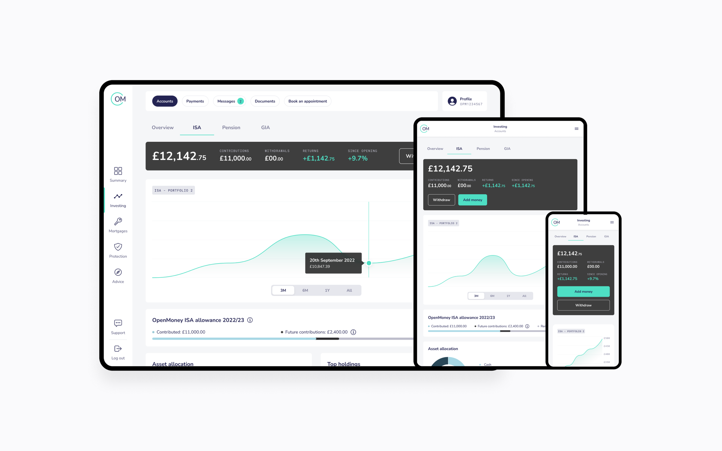
Customer Dashboard
A platform designed to provide investors with a centralised view of their investment portfolio and related information
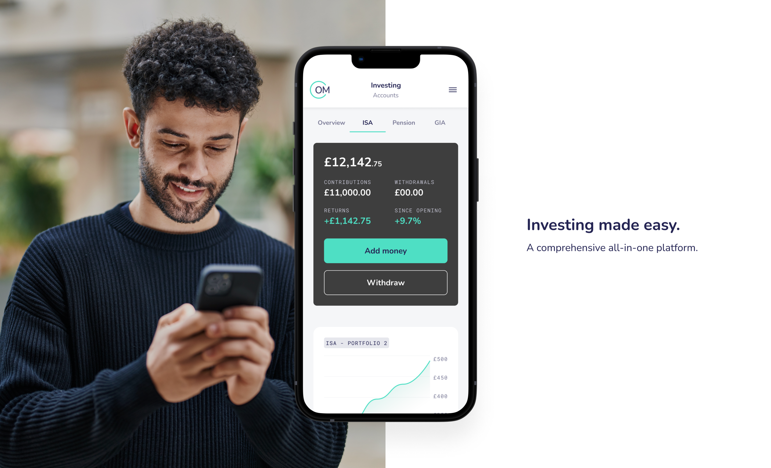
A comprehensive, all-in-one platform
OpenMoney sought to provide its customers with a comprehensive solution for tracking, managing, and analysing their products in a single, user-friendly customer dashboard. In the initial phase of developing this new dashboard, our team took charge of revitalising and redesigning the outdated Investments dashboard. Through close collaboration with the Product Owner (PO) and the technical team, we successfully delivered a captivating new interface that seamlessly integrated with the brand-new customer dashboard.
As lead designer throughout the project, I was responsible for facilitating requirement gathering during discovery sessions and translating them into actionable user flows and low-fidelity wireframes. Working closely with the product and development teams, I iteratively refined these wireframes to meet the project's criteria. Once the wireframes were polished, I collaborated with the product design team to establish a comprehensive design system. This design system served as the foundation to craft high-fidelity prototypes, which were subsequently tested for user feedback and validation.
User research
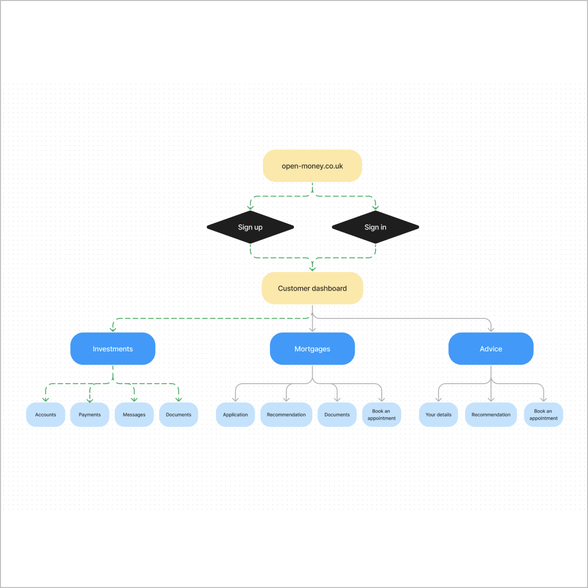
Previously, the OpenMoney product range (investments, mortgages, protection, advice) functioned independently, lacking integration and cohesion. Therefore, the primary objective was to unify them (starting with investments), enabling customers to manage their accounts more efficiently and to allow cross-selling opportunities for the business.
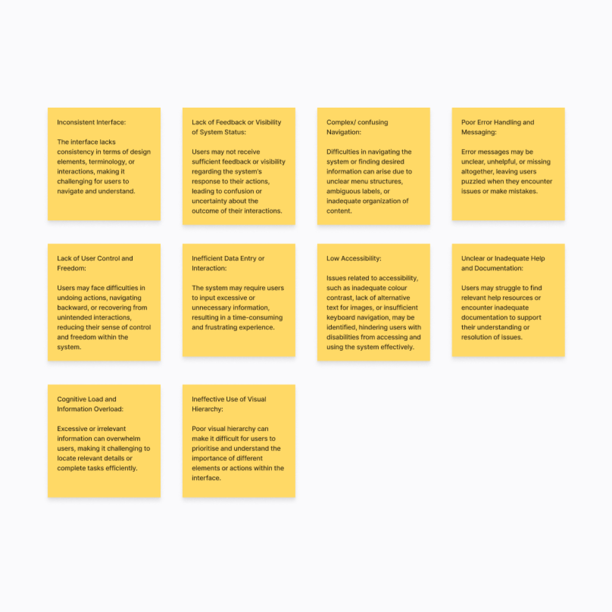
User research helped in developing well-defined user personas, which served as a reference point throughout the design process, ensuring the design resonated with specific user groups. Usability testing revealed specific pain points and areas of improvement in the existing design; paying particular attention to menu structure, message handling, cognitive load, accessibility, and navigating the payments journey.
Addressing these issues became a priority to enhance the overall UX. Analysing competitors' products and UX helped us identify industry best practices, benchmark against existing solutions, and identify opportunities for differentiation.
Ideating and wireframes
By deeply understanding the needs, goals, and behaviours of our target users, we were able to start creating a user-centred design that addressed their pain points and provided a seamless experience. After mapping out the user flows and edge-cases required for the dashboard, I began iteratively creating wireframes alongside the PO, researchers, and engineers; to ensure user needs and expectations were met, and design solutions were viable.
By leveraging the power of the design sprint, we were able to explore a wide range of creative solutions and identify a concept that had the strongest potential for success. This ideation phase laid the groundwork for the subsequent wireframe designs and implementation stages, ensuring that our final product was both innovative and user-centric.
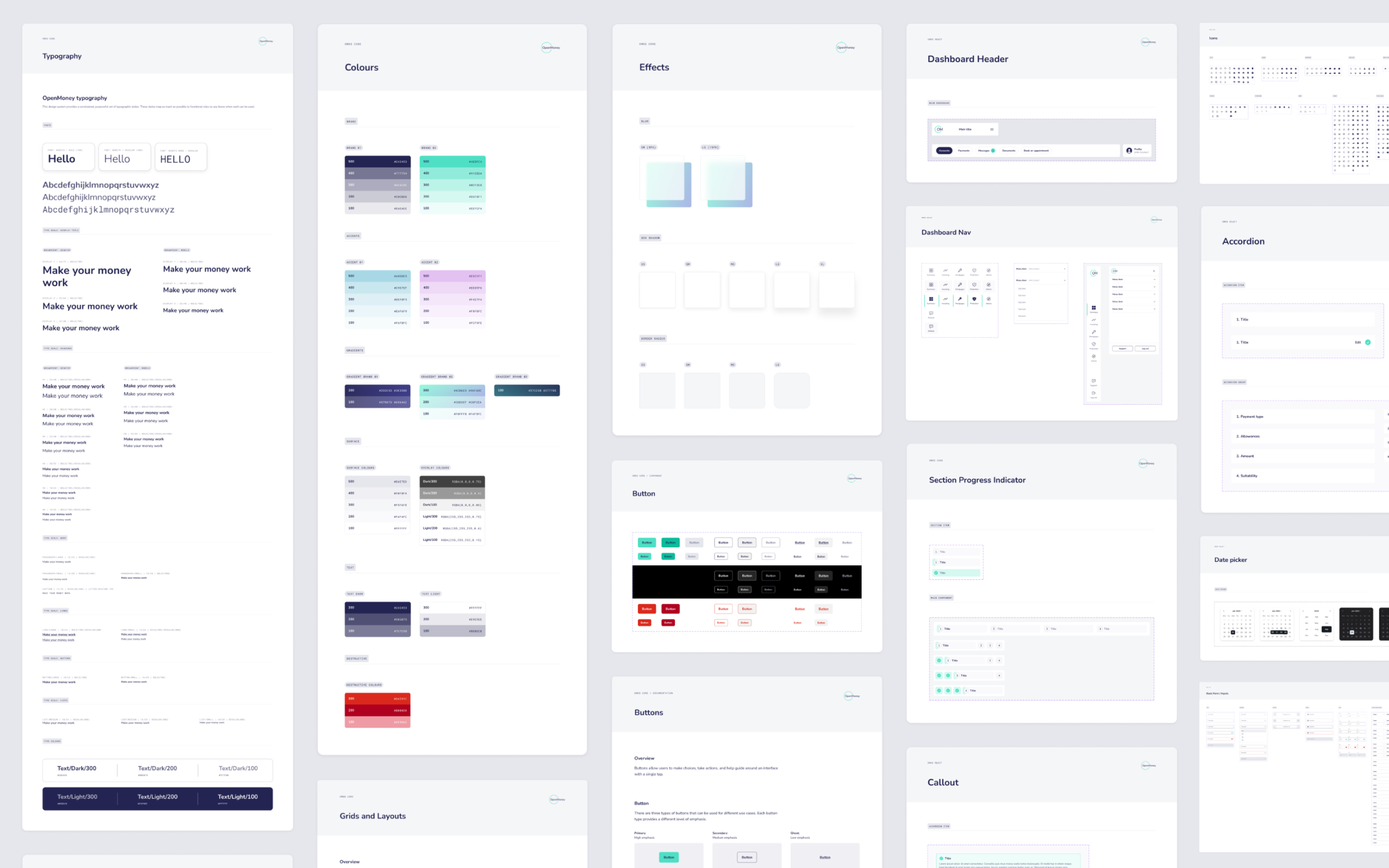
Visual Design
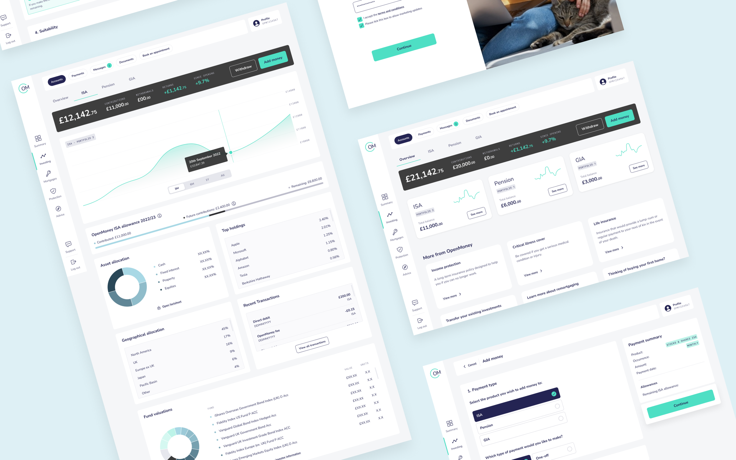
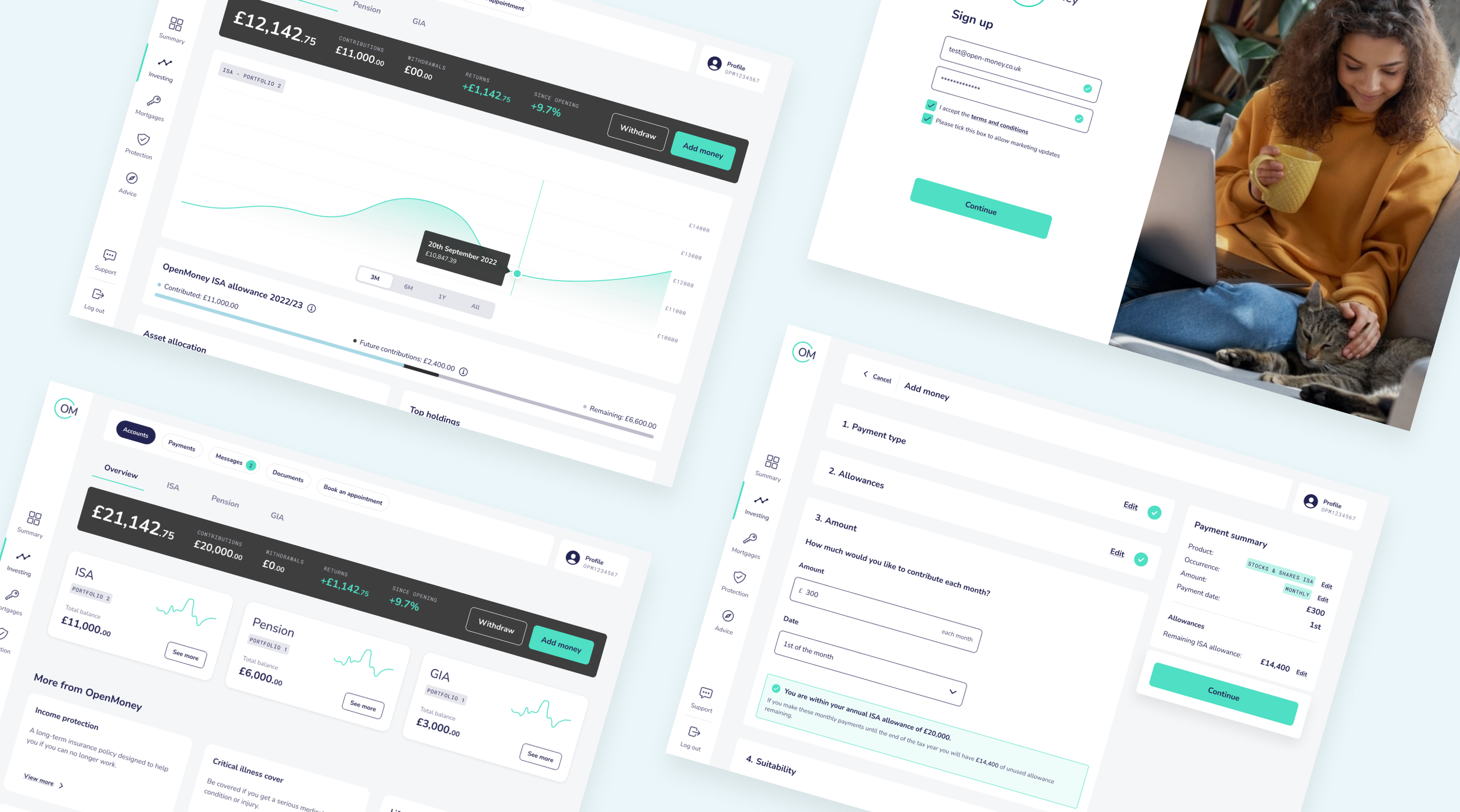
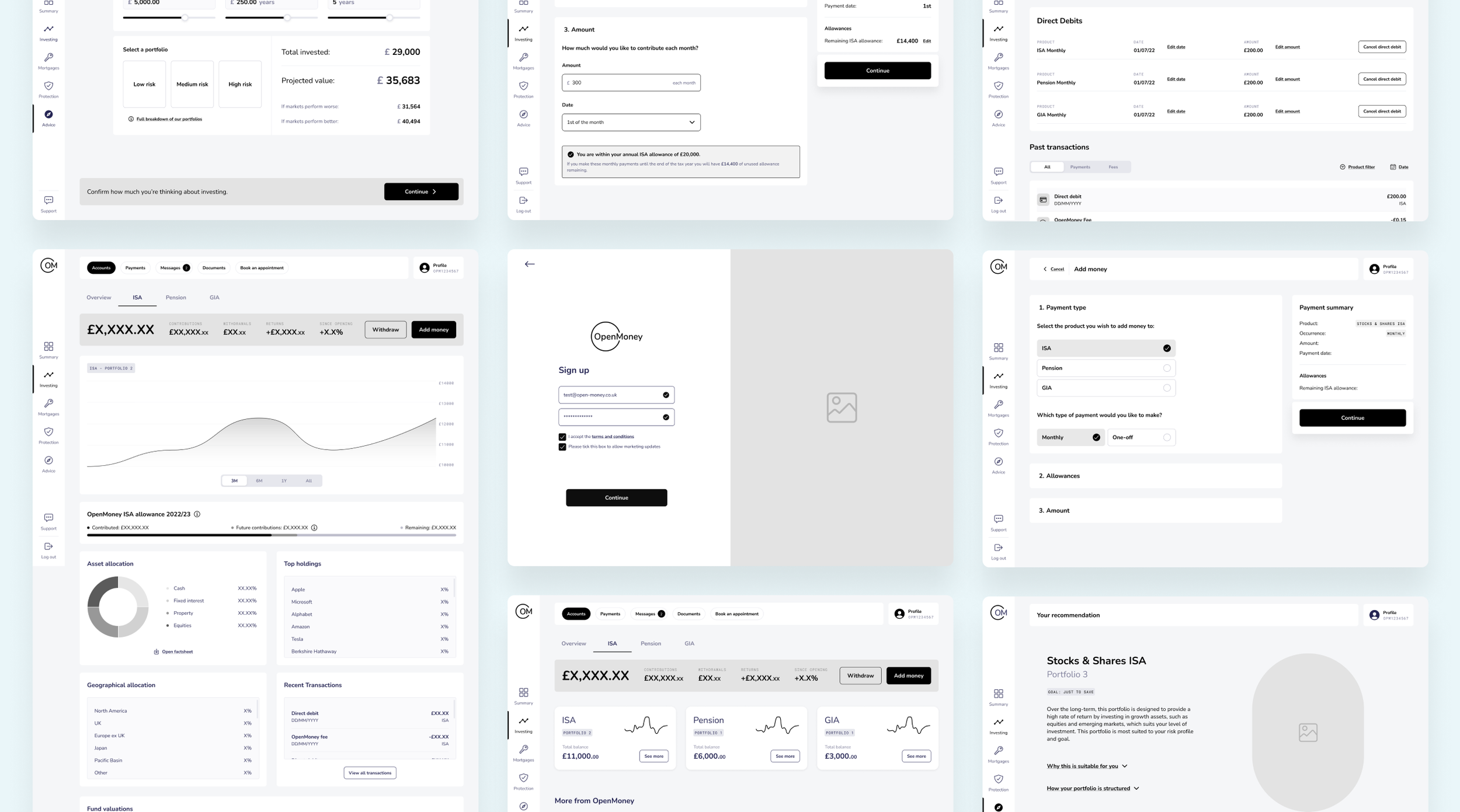
To accommodate all OM products, the side navigation was added to the dashboard. This offered a clear information hierarchy, optimised screen space, provided quick access to key features, promoted consistency, and enabled scalability. Thus, addressing several of the key usability issues identified initially.
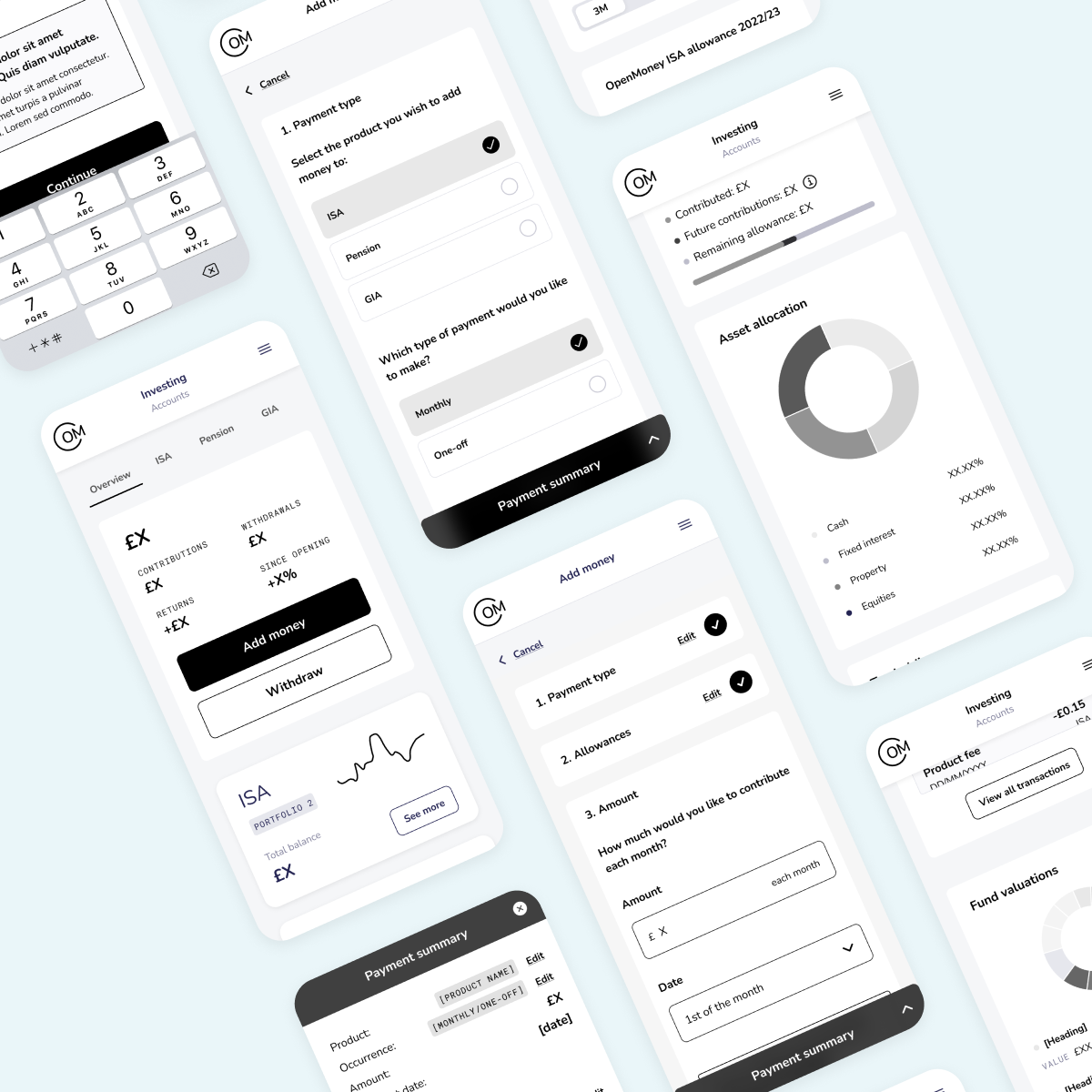
Based on research indicating that over 76% of customers accessed the dashboard via mobile, we created a more streamlined and accessible mobile journey. For example including larger touch targets, avoiding unnecessary clutter, better chunking of information, and adding mobile-friendly forms.
The payments journey was transformed into an efficient checkout process including: a clearly marked end-to-end journey to reduce journey fatigue; callouts which rendered advice at each step; and a dynamic payment summary to promote accuracy, convenience and confidence. Keeping mobile users in mind, an accordion-style UI was added for space efficiency, greater user control and interactivity, and reduction in cognitive load. The accordion enabled responsive design by neatly stacking sections and allowing users to expand or collapse as needed. This ensured that the content remained accessible and readable on smaller screens, contributing to a seamless and enjoyable mobile experience.
As soon as we had the site's core pages and journeys planned out and signed off, we started adding the final touches in accordance with the brand identity. Using our design system and guidelines for image selection, typography, and current minimal design trends, we started to give the website pages a personality and enhance the user experience.
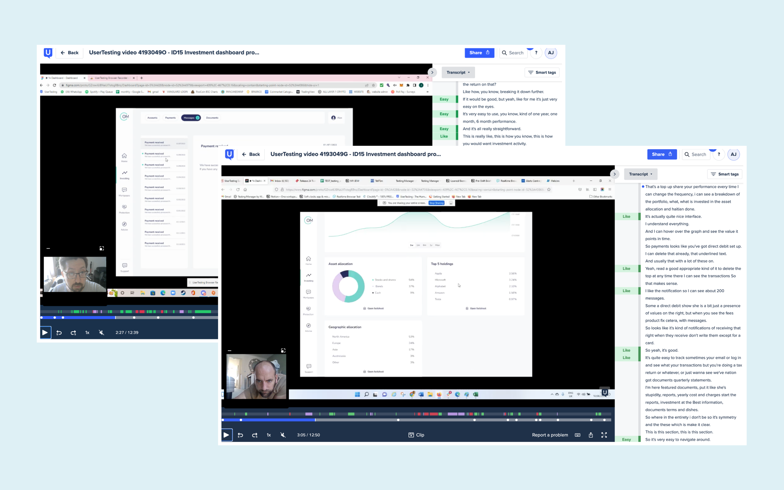
Usability Testing
To ensure the effectiveness and usability of the dashboard designs, a comprehensive user testing phase was conducted. The primary objective of user testing was to gather valuable insights and feedback from the target users, allowing us to refine and optimise the design based on their needs and preferences. After selecting our participants from our persona research, test scenarios and tasks were carefully crafted to simulate real-life situations and capture the core functionalities of the customer dashboard.
Results
Based on the findings from user testing, iterative design cycles were undertaken to address identified issues and enhance the user experience. Changes were made to the interface (e.g. the placement of tooltips), terminology used, interactions, and overall usability of the product. Positive feedback and successful task completion rates validated the effectiveness of design decisions made during the product development process. It provided reassurance that the design was aligned with user expectations and needs. Participants expressed satisfaction with the product's functionality, ease of use, and overall experience. Their feedback indicated a high level of engagement and a positive perception of the design.
Overall, by conducting user research, creating prototypes, and iterating on user feedback, we delivered a seamless and intuitive all-in one platform that resulted in a 28% increase in user engagement. Post-release, users were spending less time navigating journeys such as the payments process and appointment booking, and click maps showed that customers were engaging with our other products advertised across the dashboard.